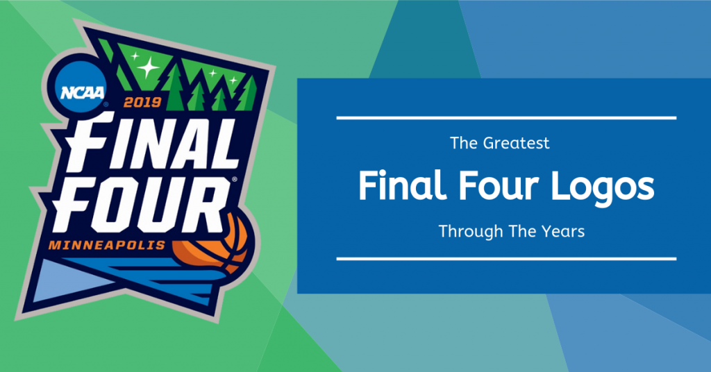
Did you know that since 1979, the NCAA has created a different, customized logo for every Final Four? Each design helps cultivate the excitement of March Madness, while also showcasing the city where Final Four festivities take place.
As college basketball fans and design enthusiasts, we love the creative techniques used to generate these unique logos.
With the 2019 Final Four coming up this weekend, the CWM team took a look back at every logo since the tradition began. Check out our favorite designs below:
New Orleans, 1982 Men’s Final Four
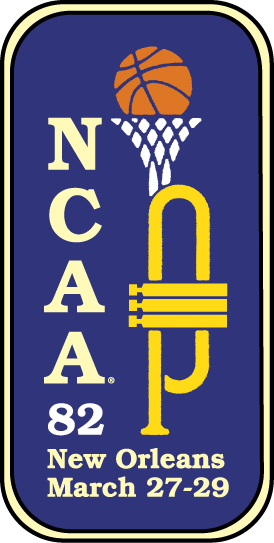
We love how this logo uses creative design to celebrate not only basketball but also the culture of that year’s host city, New Orleans. You may notice the omission of the phrase “Final Four.” Instead, it highlights “NCAA” in Slab Serif Typeface. Interestingly, the term “Final Four” hadn’t become popularized yet– it first appeared in the 1986 logo.
Richmond, 1994 Women’s Final Four
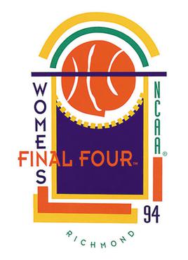
In addition to being very ‘90s, this design cleverly incorporates imagery of a tournament banner. The basketball’s organic shape contrasts with the clean lines and geometric shapes of the remainder of the design. This grabs our attention and focuses it in the middle of the logo.
The varied typeface, combination of warm & cool colors, and non-traditional text alignment contribute to the abstract style, creating a fun and intriguing design.
Houston, 2016 Men’s Final Four
![]()
This Final Four emblem embraces both the banner and trophy imagery associated with March Madness. The contrast between red and white, as well as the basketball breaking up the symmetry, help make the design pop. The stars in the background are a nice addition as well, perhaps a nod to the NASA spacecraft center located in Houston.
Tampa Bay, 2019 Women’s Final Four
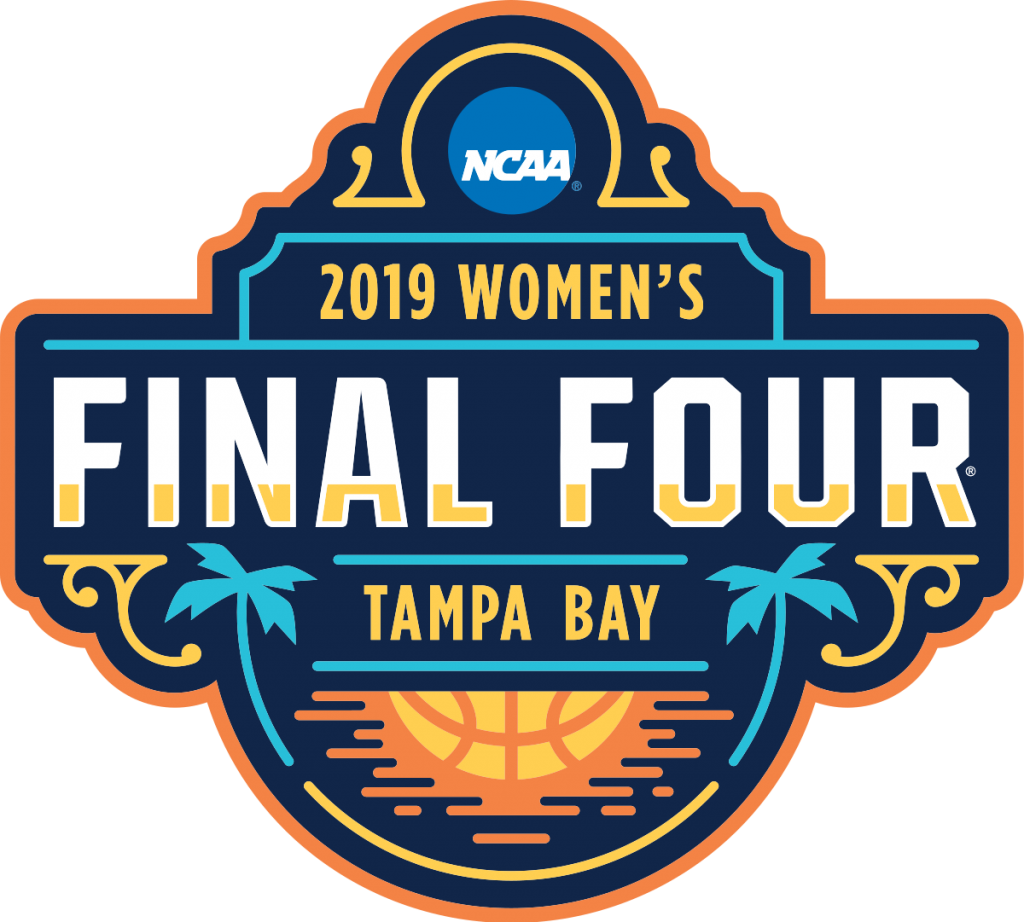
From the use of complementary colors to the basketball image blended with the setting sun, we love this design. The color added to the lower fourth of the white “Final Four” headline reinforces the sunset imagery and gives the design additional character.
With the palm trees (each with four leaves) framing the city name, this logo is as much of an advertisement for Tampa Bay as it is for the NCAA tournament.
Honorable Mention: San Antonio, 2008 Men’s Final Four
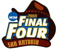
I mean, it’s a logo wearing a cowboy hat and leather belt. You gotta love it.
View the complete history of Final Four logos for the men’s and women’s NCAA basketball tournaments and share your favorite with us!
Also let us know: What techniques do you use for building logos? What design rules do you live by? Share your thoughts in the comments!
Want to learn more about how Creative Website Marketing can help your digital marketing strategy? Contact us!
Creative Website Marketing is a digital marketing agency in Nashville, TN, helping businesses throughout the country execute strategic brand awareness + lead generation efforts.