In any PPC campaign, marketers must always consider what happens once they win the click. That’s why landing pages, the web page users are taken to once they click on an ad, are a critical part of PPC strategy. However, many marketers struggle to create landing pages that convert.
Landing pages are the culmination of efforts to get your ad to show up and users to click. But in order to generate engagement, landing pages must be crafted to fit the intent of your target audience and tailored to produce conversions.
These 4 key tactics can help PPC marketers create landing pages that convert.
1. Incorporate Visual Content
The first key to creating landing pages that convert involves visual content.
We’ve all heard the phrase “content is king.” That may be true, but not all content is effective at engaging users. Truthfully, most people will lose interest reading through 800 words of straight text, no matter how well-written or informative it may be.

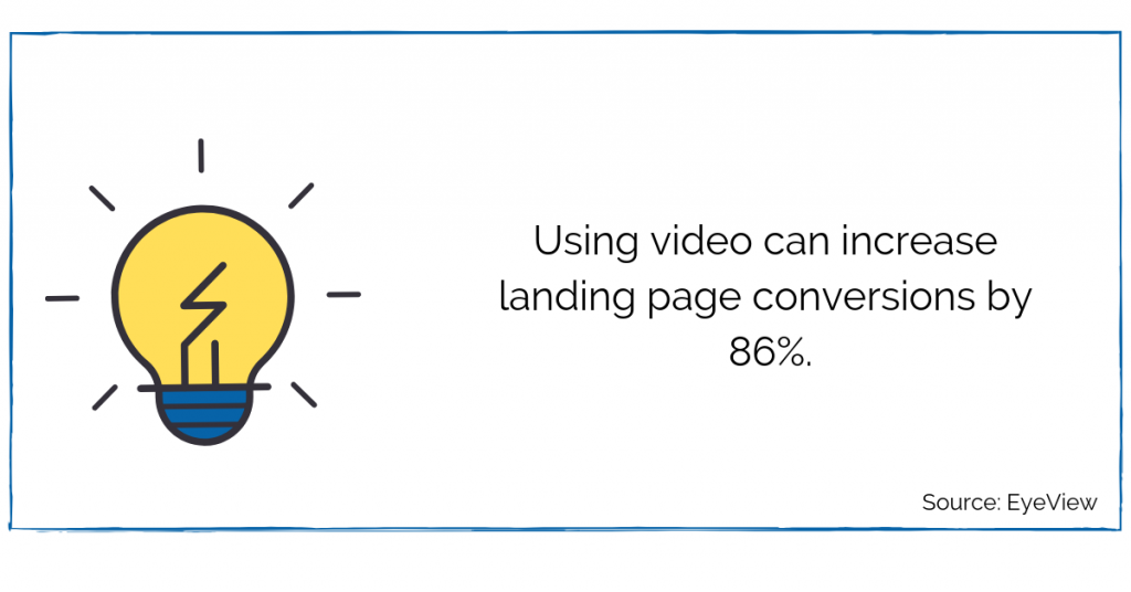
Today’s users crave a variety of entertaining and high-quality visual content. This means that high-performing landing pages will utilize videos, quizzes, infographics, and other forms of engaging and interactive media.
If your landing page is predominantly informational, text should be organized into short paragraphs with frequent subheadings– but that’s still not enough to really keep the attention of your audience. To engage users and further break up the monotony of text, support your written content with:
- Images
- Infographics
- Gifs
- Statistics
- Charts & Graphs
- Animations & Videos
Data supports the importance of visual content. According to WMG, 60% of people are visual learners, and 40% of people respond better to visual information than only text. Thus, businesses can enhance the user experience (UX) by incorporating visual content into their landing pages.
With a better UX, users are more likely to stay on the page and interact with your site. This can lead to engagement and increase the likelihood a user will convert.
2. Have a Clear Call to Action
A landing page without a clear call to action can bring the customer journey to a grinding halt.
You want to make it as easy as possible for the user to engage with your site and take the next step toward becoming a customer. This means featuring your call to action (CTA) in a prominent location, and making it stand out.
That way, a user can find it without having to search the menu bar, scroll past paragraphs of text, or navigate to a different page. This helps you guide the user seamlessly toward conversion.
Common CTAs include:
- Sign Up For Our Newsletter
- Make An Appointment
- Call Us
- Join Our Email List
- Download Your Free Ebook
- Contact Us
- Buy Now
Whether it’s a button, phone number, or form, your CTA needs to stand out. Make sure the font is large enough and easy to read. Differentiate the CTA from the rest of your content by, for example, making the button a bright color that pops off the page.
If you’re asking for any user information (email, phone number, zip code, etc.), clearly state what you need the information for and what the user will get once they provide it. This helps the user feel comfortable about providing personal information, increasing their chances of actually completing the conversion.
3. Make It Relevant to Your Ads
When crafting a PPC landing page, ensure it’s relevant to your ad. There’s no point in driving users to a page that doesn’t have the information they’re expecting to find. In fact, an irrelevant landing page will cause bounce rates to skyrocket and ad rank to drop.
For example, if an ad for athletic sneakers takes users to a page selling dress pants, chances are most people will promptly leave the page and return to the SERP.

Thus, an irrelevant landing page can result in your business:
- Losing out on customer engagement
- Spending money on clicks that don’t convert
- Signaling a poor landing page experience to Google
To ensure that doesn’t happen, the landing page must align with ad messaging and user intent. Think about the language and keywords present in your ads, and make sure they’re included in the content on your landing page.
In addition to helping your Quality Score, a relevant landing page provides your audience with the information they are searching for and showcases how your brand can meet their needs. Providing a user with the information they need in their moment of intent is a proven strategy for driving conversions.
4. A/B Test
The final tactic for creating landing pages that convert is A/B testing. Discover the best possible version of your landing page by conducting A/B tests that experiment with different layouts, calls to action, form lengths, content types, and more.
Sometimes called split testing, A/B testing allows advertisers to direct users to different versions of a landing page and measure which one performs best.
For example, if you’re not sure whether your call to action button should say Subscribe or Submit, you can conduct an A/B test to see which version produces more conversions.
Once the data clarifies which version performs better, drive 100% of users there and watch your conversions grow.
A/B testing should not be something you do just once. Instead, it should be an ongoing tactic as you gather learnings and think of new variables to test.
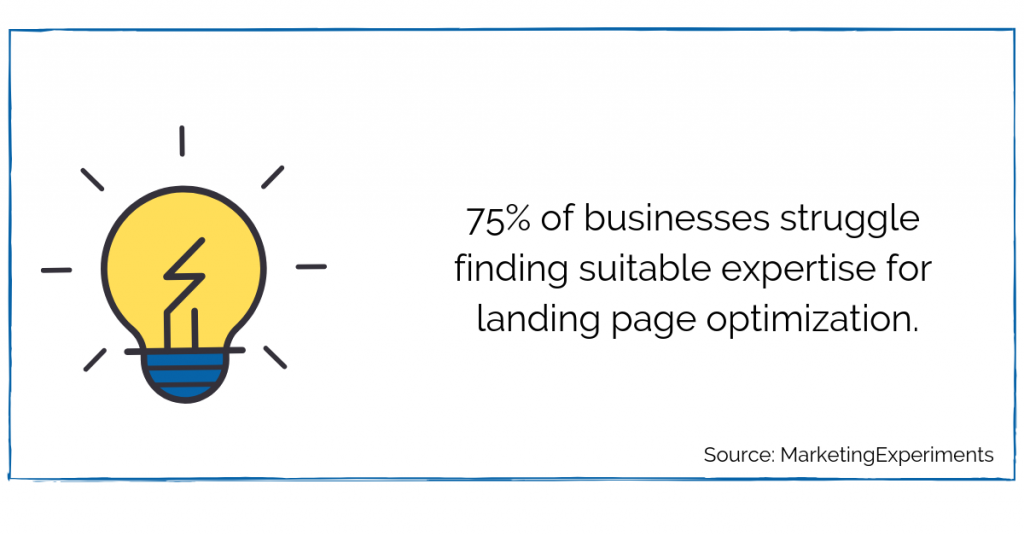 Are you looking for help with your landing pages or other aspects of digital marketing? Contact Creative Website Marketing today.

